Work AudioVerse Media ministry
The admin panel hundreds of volunteers work in, rebuilt around what they actually do
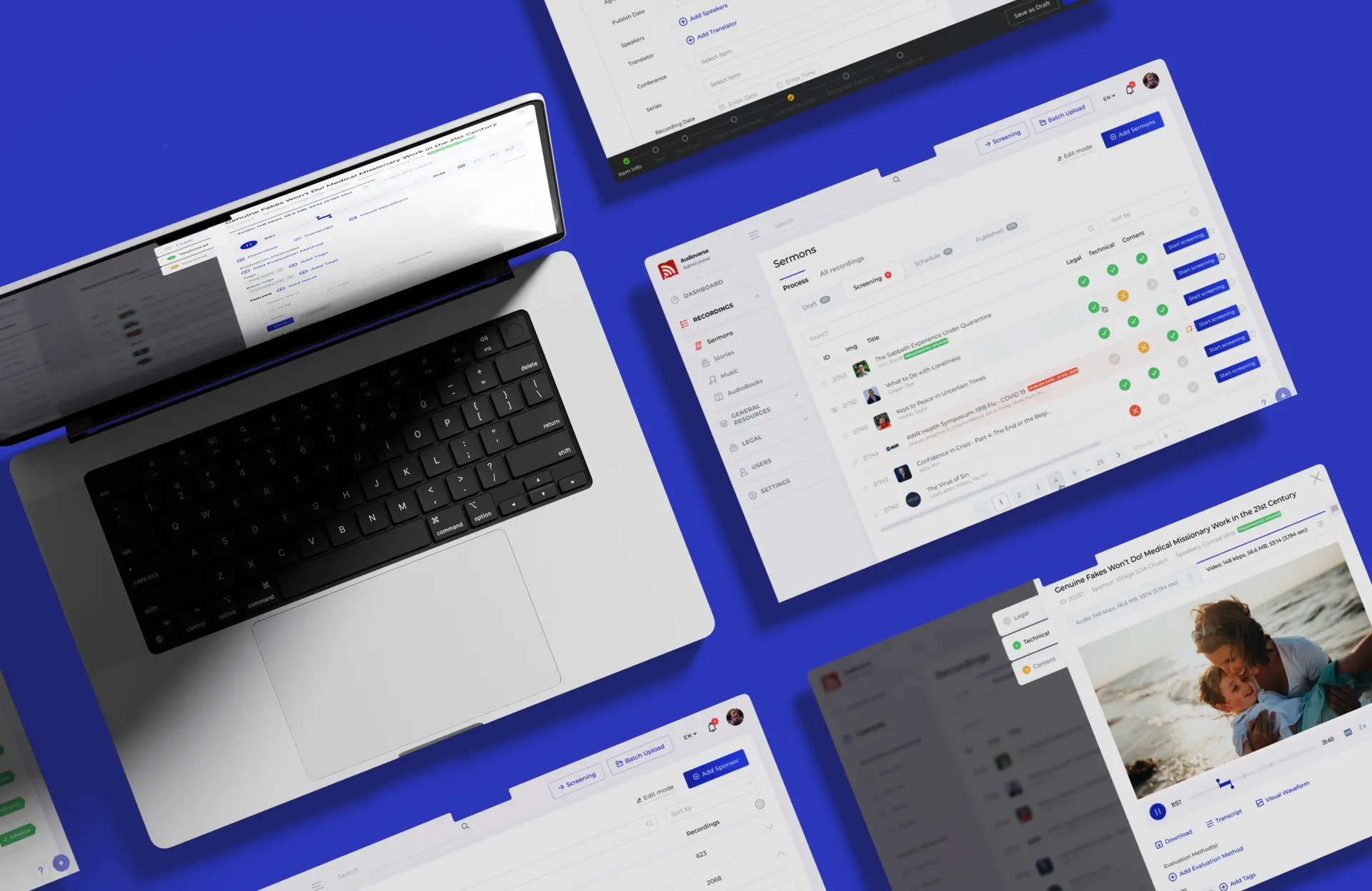
AudioVerse runs on volunteers, and all of them lived in an admin panel that was slow, awkward and full of bugs. Seven months, dozens of working sessions and more than thirty functions later, the back of the house is the part of the product people compliment.
01What they came with
AudioVerse is a sermon library that a ministry has been filling for years, and the filling is done by volunteers: uploading, screening, tagging, correcting, publishing. Hundreds of them, most giving an evening a week.
What all of them opened was an admin panel that had grown rather than been designed. It was slow, it was awkward, it carried years of bugs, and it was the only part of AudioVerse most of its own people ever saw.
02What was getting in the way
Nobody designs the back of the house. The public side of a ministry gets the attention and the budget; the screen the volunteers use gets whatever was quickest at the time, and then another feature on top of that, for years.
The cost of that is not aesthetic. A volunteer with one evening a week spends it fighting the tool instead of publishing, and a ministry that wastes volunteer evenings runs out of volunteers.
And an admin panel pulls in three directions at once. It has to be simple enough that somebody new can be useful in an hour, flexible enough for the editor who has done this for ten years, and built so it still holds when the library and the team have doubled. Those three fight each other, and most panels are the scar tissue of that fight.
03What we built
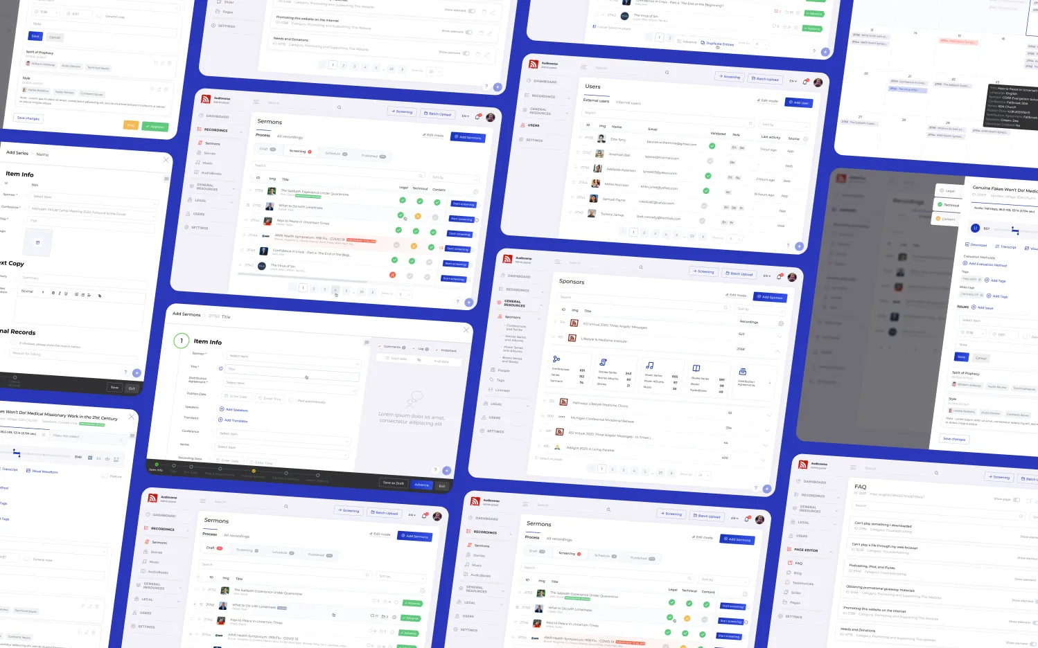
We went through the panel section by section, with the ministry in the room. Dozens of working sessions, because the only way to know what a screen should do is to watch the people who use it describe the job in their own words.
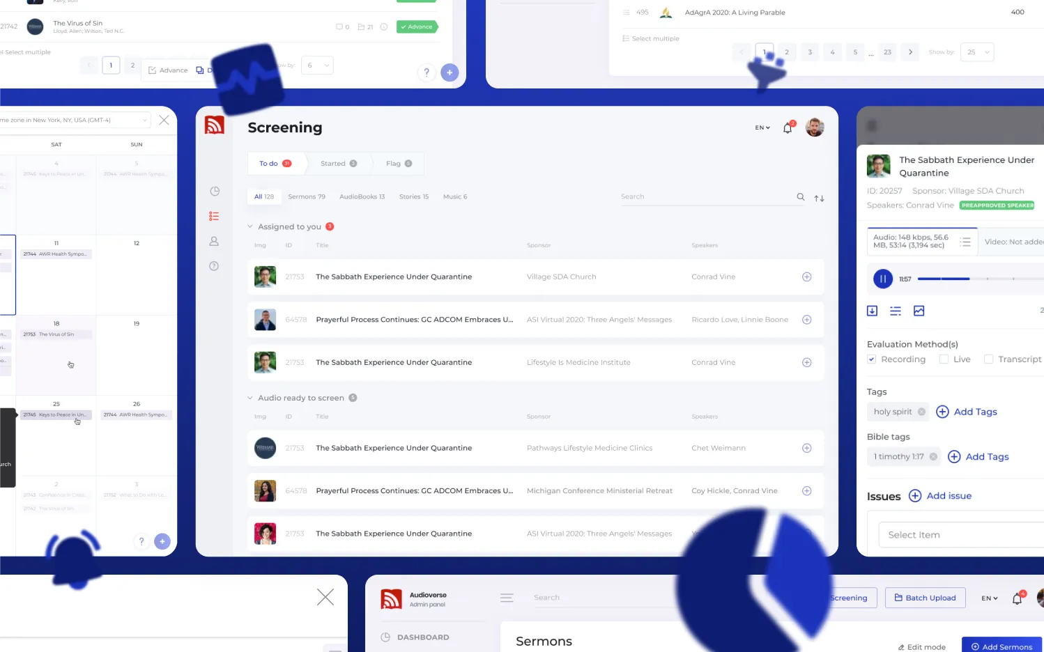
Then a web app rebuilt on current foundations: more than thirty functions, the flows that volunteers run every week shortened, the waiting taken out.
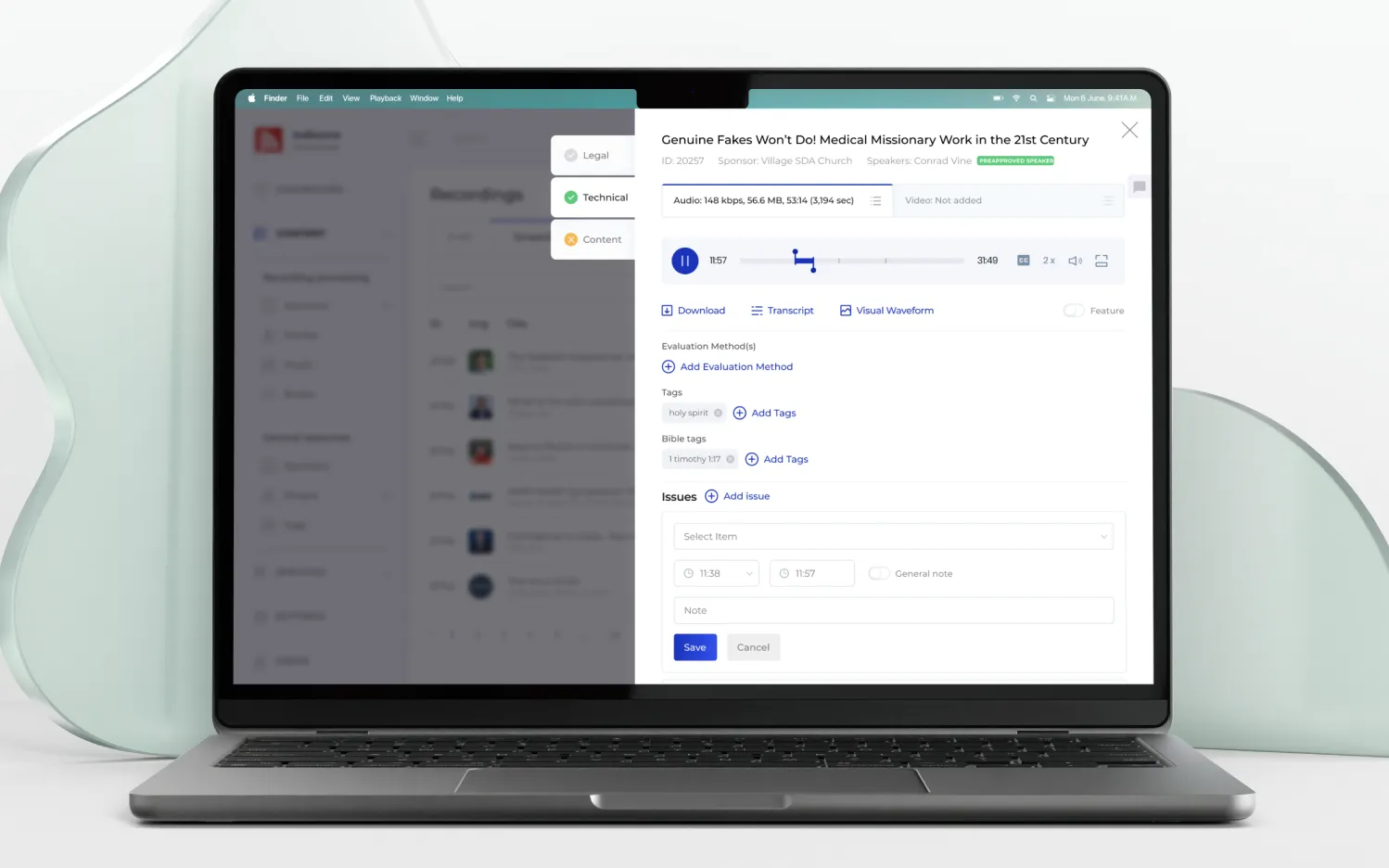
The balance between the three pulls is the design work, and the answer is almost never a setting. Defaults that fit the common case, depth where the experienced editor needs it, and nothing that makes a first-time volunteer read documentation before they can help.
Around that, the parts people only notice when they are missing: motion that explains what just happened rather than decorating it, access and permissions treated as part of the interface rather than a layer bolted on, and the whole thing working on whatever device a volunteer actually has.
Alistair Huong led this from the AudioVerse side, and it is the clearest case we have for what that is worth. A client who knows their own processes, decides, and stays with the work turns a long project into a straightforward one. We are still friends, and he still helps our ministry.
04What changed
Hundreds of volunteers now work in a panel built around what they do, and the ministry has kept publishing without the tool being the obstacle.
It changed what we are. Since AudioVerse we have known how to do this kind of work: how the processes behind a ministry actually run, and how to make an interface for them that is clear without being thin and flexible without becoming a control panel.
05What this means for you
If your people spend their time in an internal tool, that tool is your product, whatever the website looks like. Volunteers leave over friction long before they leave over the mission, and no amount of public polish compensates for an evening lost to a slow screen.
The other lesson is about who you put on it from your side. The best thing a client can bring to a project like this is somebody who knows the processes and is allowed to decide. It is worth more than any brief.
FAQ
Questions about this project
Do you only build public-facing products?
No, and the internal ones are often where the value is. If a team of staff or volunteers spends hours a week in a screen, that screen decides how much they get done and how long they stay.
Our admin panel works, it is just unpleasant. Is that worth fixing?
Count the hours. A panel that costs each volunteer twenty minutes a week, across a hundred volunteers, is costing you a full-time post. That calculation usually answers the question before we do.
How do you keep an admin simple and still flexible enough?
By deciding what the common case is and making it the default, rather than exposing everything as a setting. Depth stays available for the people who need it; it just does not greet a new volunteer on their first evening.
How long does something like this take?
This one took seven months for thirty-plus functions, with the ministry in the room throughout. The sessions are not overhead: they are the only way to learn a process well enough to design for it.
Have a project like this?
Tell us where you are today. The first call is a conversation, not a pitch, and the written proposal costs you nothing.