Work CEAR Mission organization
An app missionaries in Asia would actually open, in the visual language they live in
CEAR asked for a way to help missionaries walk with the ten people around them. The first design was modern, correct and Western, and would not have been used; what shipped was built in the register its users already read, and has been in service for five years.
01What they came with
Missionaries do not work with an audience. They work with ten or twelve people by name, over months, and the whole of that relationship normally lives in a notebook, a notes app and a memory of who was asked what. It holds up until the notebook fills, the phone is replaced, or the missionary moves to another field and has to hand twelve people to somebody else.
CEAR wanted one place for that work, for missionaries across Asia: who you are walking with, where each of them is, and what was said last time.
02What was getting in the way
The first obstacle was the record itself. A list of names in a country where that list is sensitive is not an ordinary contact list, so whatever holds it has to be at least as careful as the person carrying the phone.
The second was discipleship’s own shape. A ministry does not manage leads; it walks people through stages, trust before the encounter, the encounter before study, and a general-purpose contacts app flattens all of that into one list with a checkbox.
The third we did not see coming, and it is the reason this project is on this page. We designed the first version the way we design: clean, modern, Western, the kind of interface that wins approval in a room in Europe. Our partner, who works between Western and Eastern religious contexts, told us plainly that it would not work. Not that it was ugly. That the people it was for would not read it as something meant for them.
03What we built
So we put our own instincts down and started from the audience. WeChat and the wider Asian web live in other colours, other densities, another idea of what a friendly screen looks like, and we rebuilt the interface in that register rather than ours.
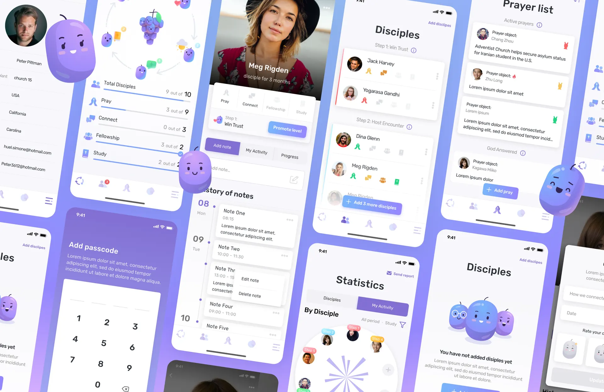
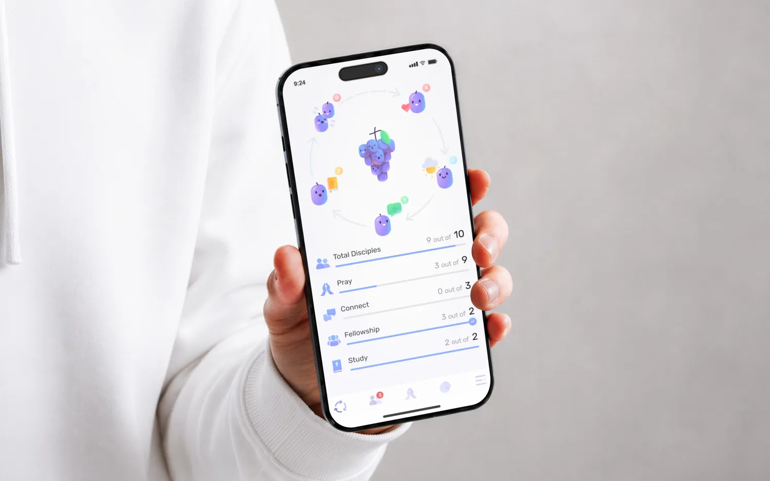
The brand came from the same place. A cluster of grapes: ten berries, the ten people in a missionary’s circle of influence, each berry carrying its own feeling, the whole thing warm rather than corporate. It says what the app is for in one glance and in no language at all.
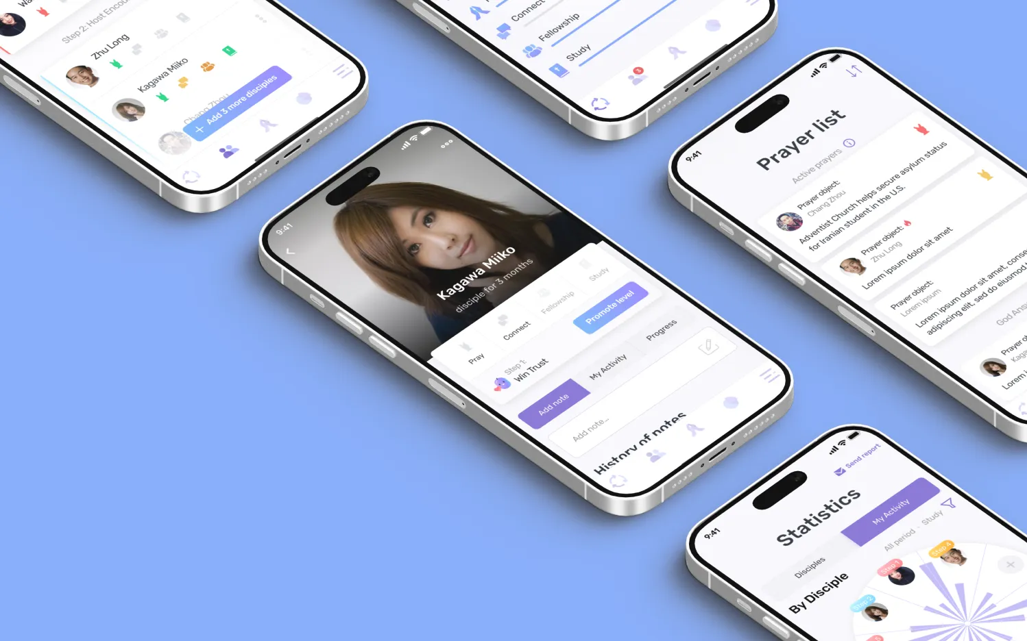
The app underneath is a mobile app built around people rather than records. Every disciple has a card, the ministry’s own stages are the ones in it, and moving somebody forward is a deliberate act by the missionary rather than a status that changes itself. Dated notes, prayer and study, and the statistics a missionary sees about their own work.
Where it is dangerous to be a missionary at all, the app had to be safe to be caught with: a passcode on the device, anonymisation, and a record kept as small as the ministry can work with, because what is not collected cannot leak.
It shipped on iOS and Android, with documentation written for the people who would keep it running. This was built before any of the tooling everyone now takes for granted, and we have maintained and updated it since.
04What changed
More than a thousand disciples are being walked with inside it, by missionaries in regions where the work carries real risk, and it has run for five years without interruption.
The part we did not expect to keep is the lesson. We would have shipped a design that was good and wrong, and the only reason we did not is that somebody who knew the audience said so out loud before it was built.
05What this means for you
A design can be correct and still be wrong. Ours was clean, current and defensible, and it would have failed for a reason no amount of craft inside our own studio would have surfaced: it was not written in the visual language of the people who had to open it every day.
So before anyone polishes anything, find a person who belongs to the audience and let them tell you what you cannot see. Not a focus group at the end. Someone at the start with permission to say that the whole direction is wrong.
FAQ
Questions about this project
Could our ministry have something like this?
The structure transfers; the stages usually do not. Every ministry disciples in its own order, and the first thing we do is map yours instead of imposing somebody else’s. If your method is close, the work is configuration and language. If it is different, the app is the same shape with your stages inside it.
How is the information about people kept private?
The app opens behind a passcode on the device, and we kept the record as small as the ministry can work with: what is not collected cannot leak. Where the people in it would be at risk, that constraint comes before any feature.
Why did the first design have to be thrown away?
Because it was ours and not theirs. It was a clean, modern, Western interface, and the partner who works with that audience told us it would not be read as something made for the people using it. Colour, density and visual idiom are not decoration in a project like this; they decide whether the app is opened at all.
Who maintains it after launch?
We have, for five years. The app was documented for the people who run it, and we handle updates and the platform changes that iOS and Android bring every year. A project that only exists while we are in the room is a project we built wrong.
Have a project like this?
Tell us where you are today. The first call is a conversation, not a pitch, and the written proposal costs you nothing.